
Quinnipiac Men’s Lacrosse Schedule
In this project, I designed a calendar that showed the Quinnipiac Men’s Lacrosse 2022 schedule. I always had a love for lacrosse and wanted to branch out my design skills with a sports edit. I kept on going back to this specific project because it is something I have never done before. When I started, I was focusing on the 2021 schedule, but since then completely redid it for the 2022.


Research
I looked up multiple poster designs, calendars, and sports edits to try and figure out what design works best for what I want. What stood out to me about these posters was how modern and simple they were. Calendars should be straight to the point and I believe a simple design like this will help accomplish that. With focusing in on lacrosse, I wanted to make sure that I created a graphic that will catch someones eye. Like these photos! A nice edit will have the people talk and I loved the images having a simple accent color to help everything pop.
Sketches
Here, I focused in on setting up possible layouts for what the possible calendar design can be. I wanted to keep it simple and something that stands out.


Color Swatches

With it being a poster for Quinnipiac Men’s Lacrosse, I was very limited to what colors I can and cannot use. Though it was not through the actual program, I wanted it to stay within their guidelines.
Typography
For the typography, I wanted to use a typeface that was very clean and looks good with print. I decided to go with the fonts, Century Gothic Pro and Lemon Milk for all the designs I have created. Here I showed how the typefaces look in all of their variations so I can get a better feel of what impact it could have on my design.

Composition 1
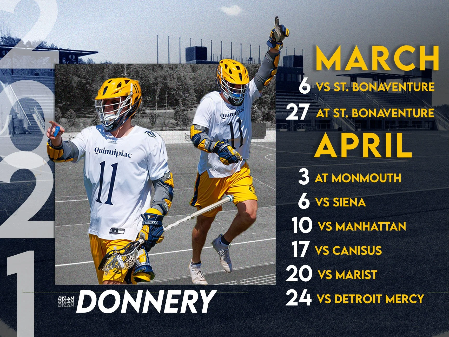
After doing some research on sports edits, I wanted to approach my first composition with showing the field the team play at and one of their top players. At the time when I first started this, it was during covid and did not have a lot of games scheduled out.
Composition 2
After creating my first composition, I then decided to approach the calendar with a more simple and clean look. This was done by making the background more simple and only including one picture of the player. I liked how this one came out, but wanted something that would stand out even more.


Composition 3
Lastly, I kept the simplistic look like the second composition, but made this one horizontal to see if that would change my thoughts on the more simple look. After receiving comments on all three compositions, I tried coming up with more designs which lead to my final design six months later.
